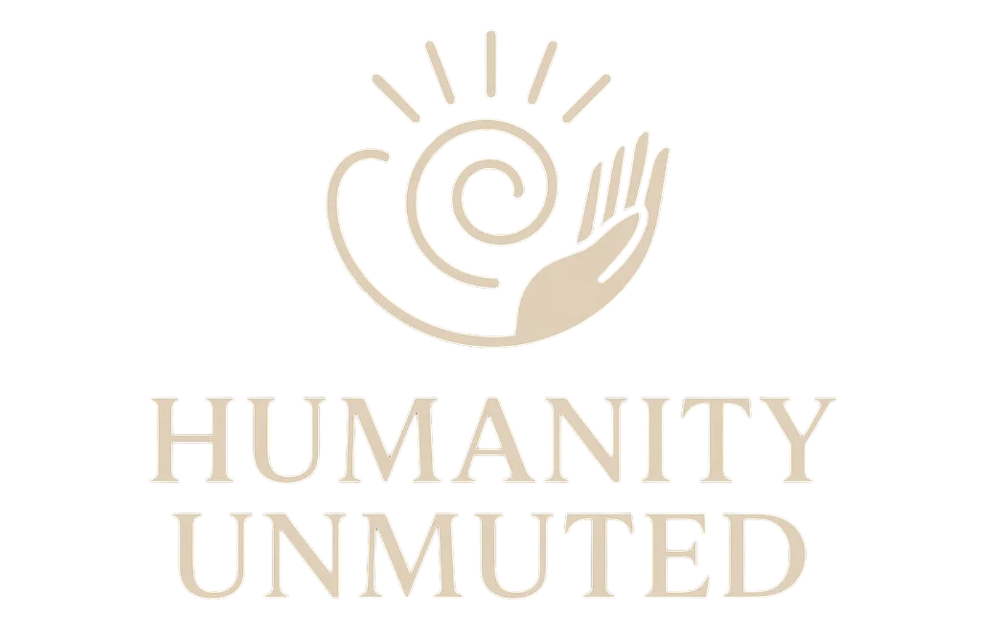
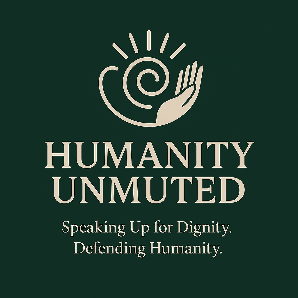
Every detail in our logo serves a purpose, just like every person we stand beside. Our design choices were made to reflect dignity, empathy, and courage.
Logo Symbolism:
- The Hand symbolizes both support and speaking up. It’s open, not clenched; reaching, not pointing. It represents being heard and held.
- The Radiating Lines are not noise, but voice, light, and energy unmuted — a visual echo of what happens when we speak up with compassion.
- The Spiral in the Palm reflects the layers of human dignity: complex, evolving, and deserving of protection. It also symbolizes growth, healing, and the strength of introspection.
Our Colors
Humanity Unmuted’s palette draws from tones that represent stability, empathy, connection, and courage:
- Deep Juniper Green: stability, trust, and grounded strength
- Charcoal Gray: strength, reliability, clarity
- Cream + Soft Beige: warmth, gentleness, approachability
- Rose, Clay & Muted Blush: tenderness, empathy, emotional depth
- Sage Green: harmony, balance, gentleness
- Soft Lavender: healing, reflection, peace
- Terracotta Clay: authenticity, warmth, earthiness
- Muted Gold: hope, enlightenment, courage
- Deep Navy: authority, trustworthiness, professionalism